"Quantum" AI Data Dashboard
Translating complex data into actionable insights.
Translating complex data into actionable insights.
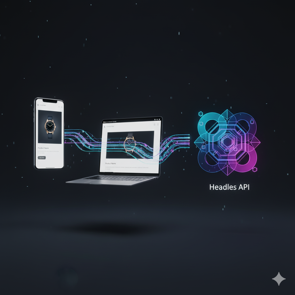
The client had a powerful AI engine but their dashboard was unusable. It was cluttered, confusing, and overwhelming for non-technical users, leading to poor customer retention.
I led the complete UI/UX redesign. My process followed a user-centered design (UCD) methodology, starting with stakeholder interviews and user persona development to understand the core problems.
I created low-fidelity wireframes to map out new, simplified user flows. After validating these, I moved to high-fidelity prototypes in Figma, focusing on a "progressive disclosure" design. This principle shows users only the most critical information first, with clear paths to drill down for more detail, preventing overwhelm.
After finalizing the design, I implemented the new frontend using React, creating a modular library of data visualization components with D3.js for future development.